
I’m tired of the grey. I’m also tired of the cars that are various shades of primer. They just look bad.
You don’t like Glossy Primer either?
There’s also that weird Truck that’s even missing the primer.
Ah, yes, the truck with “easily replaceable body panels” meaning that some mischievous teens with a screwdriver can strip your quarter panels while you sleep.
I’ll take that over a methhead with an angle grinder tbh
Once saw a photo of a fairly new BMW with the front fender all cut to pieces so someone could steal the windshield washer tank… Kinda makes you wonder who the fuck would do that, given that to own one of those cars, the thief would’ve had to have money first.
Maybe it’s like catalytic converters, where there’s like 0.005g of platinum or something in it. Lol
The auto industry is dead it seems (in so many ways), it just hasn’t been told this fact yet.
For me grey is a nice utility color. Black cars show dirt easy as do white cars. Grey cars, not as much.
If you want to hide dirt, go with paisley, or something comparable.

Honestly, nothing is better at hiding a stain than a Hawaiian shirt, that same principle can be used anywhere.
Some car manufacturers have used WWI-style dazzle camouflage to make it harder to photograph prototype cars.

If it’s hard for a viewer to even make out the car’s lines, probably hard to make out anything on the car too.
You know what, fuck it, I might consider that, given that my daily driver is starting to become a bit of a project car anyway. Buying a Chinese MPPS clone was a mistake, now I want a front-mount intercooler and a hybrid turbo and I already know what car’s injectors would easily spray more than mine if I raise the rail pressure which I can do no problem since I have a CP3 R90 high pressure fuel pump and…
The downside of both of those cars is, that you probably get pulled over on a regular basis.
I like colorful cars more, I really noticed how bland they were on the east coast of the us recently. White, grey, black. Almost all of them.
On the other hand, people seem bizarrely obsessed with washing their cars. I get the idea of removing salt if you live where that’s a thing, but otherwise I only wash my car maybe yearly. I just don’t care that much.
We have a papyrus white Trabant, and it’s the exact colour of dried dirt. Never looks dirty.
They all have the same general shape, why not the same general color? /s
Same with sofas!
I had to buy a used one during COVID and the only thing left was gray, so I have a gray pilot now 😭
People across the road just painted their house a bright teal. It looks really bad because they painted everything! The siding, the brick, the accents, and “shutters”. They left no contrasting lines or spaces, just teal everywhere.
And to top it off they hired someone to do it! So I agree, people dont understand color.
Not the brick 😭 will people stop fucking painting brick? You can never undo it, it’s bad for the brick and it’s ugly af. Leave brick alone.
Yeah, quite literally, just use a different material if you want to paint. Already have brick but want a different color? Then add another layer of construction material, you don’t have to have exposed brick if you don’t like the color of bricks.
thinks a bit
Is it really true that houses need to have contrasting colors, that that objectively is preferable? Maybe it’s just what we’re used to, so it feels more “normal”.
Like, I can certainly think of architectural styles that don’t have much color variety.
https://en.wikipedia.org/wiki/San_Estévan_del_Rey_Mission_Church

The San Estévan del Rey Mission Church stands at the northern end of the large plaza that takes up the southern end of the mesa top that houses Sky City, the traditional Acoma pueblo settlement that has been continuously occupied since prehistoric times. It is a large adobe structure, built in a wall and beam construction style.
Brutalism often just exposes the raw color of concrete for the whole exterior:
https://en.wikipedia.org/wiki/Teresa_Carreño_Cultural_Complex

Architectural style: Brutalist
A lot of modern architecture styles go in for a stark white:
https://en.wikipedia.org/wiki/Villa_Paul_Poiret

Villa Paul Poiret in Mézy-sur-Seine, Yvelines, France, is an early 1920s Cubism-inspired Art Deco private house originally designed by architect Robert Mallet-Stevens.
The house stands in 48,500 square metres (12.0 acres) of parkland in Mézy-sur-Seine, to the west of Paris, overlooking the Seine Valley. It is constructed in reinforced concrete in a geometric style, has 25 rooms on three levels, 800 square metres (8,600 sq ft) of internal space, an upper terrace with panoramic views, and a 7-metre-tall (23 ft) corner salon with floor-to-ceiling windows.[1]
Greek Revival architecture exteriors tend to have the same sort of uncolored surface. Amusingly, this was based on a misunderstanding of Greek architecture — we often think of classical Greek statues and buildings as white marble, though that’s because the paint that was once on there wore away prior to archeologists discovering them. In the early US, we used it a lot in government buildings because it was associated with democracy:
https://en.wikipedia.org/wiki/Greek_Revival_architecture

EDIT: And the styles based on Spanish Colonial stuff are often monocolored other than having a terracotta roof:
https://en.wikipedia.org/wiki/Spanish_Colonial_Revival_architecture

Every single one of those examples does have contrasts though. The mission Church wood is a different color, and the shadows you can see of the ceiling provide a third. The brutality has starkly different windows, the stairwell is accented in beige, and there is a lot of texture in the concrete. villa savoye has contrasted base, window trim, and again the white starkly contrasts with the reflective windows. Idk what this person’s neighbor house looks like but solid untextured teal (or any color) would look pretty weird imo without at least some differences in tone, texture, or like natural colored window frames at least.
Okay, but now imagine any of those buildings you cited painted teal.
(They work because they’re the authentic color of the materials they’re made out of and people interpret authentic as “correct,” not because monochromatic is inherently good.)
Hmm, maybe it doesn’t work so well when it’s bright teal tho.
Nobody will ever know unless some brave soul tries painting the Lincoln Memorial teal.
Actually…you know, I could see Trump deciding to gild the thing. He put gold all over in the White House…
I mean, just look at the garish blue reflecting pool.
Why does this comment feel like AI? I’m not saying it is, but it just feels like it. Maybe I’ve been too involved with them lately.
The ol “landlord special” method
We have someone here that did the same, but with white. Siding is white. Brick foundation and walkway-white. Chimney shutters windows doors, everything white. Also hired someone and they did a terrible job, you can see all over spots where they didn’t put enough paint. It genuinely looks like a monstrous bird took a shit on it.
I painted my house purple
A friend of mine painted his old red farmhouse cherry red with purple accenting on the eaves, doorframes and such. the doors are orange. It all looks really good, partially because he got a degree in art that included a lot of color theory work.
I’d love to see that, because your description of red, purple, and orange makes me think of a clown house lmao
My house is a darker shade of purple, the trim is a lighter shade of purple, and the doors, garage door, and eaves are all white with the slightest hint of pink. I definitely don’t have that sort of formal knowledge, but I think it looks great
Orange is a highlight of red and purple a lowlight or shade of red, both analogous colors to red, so honestly that sounds genius. (I’m not an artist, I’m just sitting next to a color wheel and see it all the time: I’m trying to work on my own color theory.)
The door on the house I just bought is purple and I plan on painting the rest of it purple if I can convince my family lol
Article needs a LOT more pictures.
I don’t know if its validating or disappointing to be seen so thoroughly by an article like this. On the one hand, I absolutely identify with the memes that are like “men will live like this without issue” and it’s just an arm chair and TV in an otherwise empty room. Aesthetics, while noticeable to me, are simply never much of a priority. However, at the same time, I also feel like taking ownership of your living space and having the confidence to imprint aspects of your personality on it is a mark of maturity in some ways.
So, I find myself stuck in an increasingly silly feedback loop of not caring about aesthetics -> feeling bad for not caring -> trying to brainstorm some ideas for how to spruce things up -> having anxiety over the infinite combinations of possibilities without a “correct” answer -> throwing my hands up and returning to not caring.
We work on it in therapy, I guess, lol.
I also feel like taking ownership of your living space and having the confidence to imprint aspects of your personality on it is a mark of maturity in some ways.
I’m in my forties and I’ve never been in an apartment I’ve been allowed to alter or paint. Some of us are in that situation because it’s pointless to lose your damage deposit over it, and with rental prices increasing endlessly, living in one place longer than 2-3 years is really unlikely, and I got sick of trying to decorate just to have to tear it all down constantly.
That’s the reality for a lot that people don’t t understand. Landlord white and don’t hang pics. The second aspect is not really collecting anything as you may have to move fast. It’s unfair and soul destroying.
Yeah, because I actually do like painting and decorating and unique color schemes. Color theory isn’t fucking hard or something. There’s free complementary colors tools online.
Anyway, just was annoyed that someone thought that doing this was a sign of “maturity” as if that’s not just one more aspect of “adulthood” that has been denied to every generation from millennials on downward.
If you’re worried about the damage deposit, don’t paint. At $60 a gallon the paint and other materials can easily add up to be greater than that deposit anyway.
But on the other hand, if you do want to make your space your own and your willing to put in the time and money to do it, that deposit is just one little additional cost, and it’s deferred to “later” ^tm .
My internal conspiracy theory is that McDonald’s deliberately chose the boring, gray and block redesign for nearly every location now BECAUSE it’s less inviting.
They don’t want people to eat in, or even stop by to go to the drive thru. What they want is to push the fast food market towards delivery, because the profit margins are so much better. They can’t just close dining rooms and drive thrus entirely, because that would scare consumers and drive down stock prices. So instead they’re using boring shades of gray and hostile design to make people not WANT to go to McDonald’s, and instead just order it through DD.
Interesting theory, but like someone said it’s cuz they’re also a real estate company. Easier to sell someone a building that’s a grey “blank slate” instead of a red and yellow playground with a giant “M” on it.
I have a different theory.
McDonald’s is a real estate company. The parent company in the US owns a lot (most?) of the locations of the franchise restaurants.
Real estate appreciates over time and grey is easy to sell to another business (since it’s all commercial real estate anyway) since it doesn’t require a major remodel like some other colors might.
Because IMO at least, McDonald’s interiors went boring before the delivery thing really kicked off.
There’s a big factor that i didn’t see in my skim of the article: painting and repainting costs time and money. In the 60s, 70s and 80s consumers had the money to mess around with colors on a whim. You had the money to buy a new car and keep it in whatever condition you like. If you changed your mind later, nbd, just change it back.
These days I don’t know anyone with a house (of those who can afford them) who can spend money on anything but the safest and most conservative options. Even if you put aside resale value of a home or vehicle, a daring color will probably fade or your tastes will change or it will clash with new surroundings or become hard to match as it’s phased out of stock.
In 10 years I’ll probably feel exactly the same about my off-white wall as I do now. It will look the same with basically any furniture. It might fade to a slightly different shade of unobtrusive white. Why would I spend my limited money to give my future self headaches? Just for a different vibe?
As someone lucky enough to have been able to afford a house, the best thing we did was paint the main level no less than 4 different colors including a bright fuchsia in the bathroom. an upstairs bedroom/bathroom each got their own color & in the other bedrooms we’ve left the colorful blobs & rainbow that the prior owners painted bc they were kids bedrooms.
The basement was out of our budget to paint, & it’s def the saddest room in the house with its off white walls
In the 60s, 70s and 80s consumers had the money to mess around with colors on a whim.
Maybe rich people did. This is a really wild take and I don’t think it’s grounded in reality at all.
miserable
Calling bullshit on this. Color will make a comeback. I give Wet Paint Grey 2 more years before people have had enough of it as a favorite car color. I think interior and exterior house paint colors might not improve until the fall of global fascism which admittedly doesn’t seem likely anytime real soon.
Well considering up until the 1960s everything was in black and white, this just seems like another one of those fads that becomes popular again years later like JNCO jeans.
My wife yelled at me for getting the wrong red, because I got crimson instead of ruby. So yeah I get it.
You can get the wrong grey now too though. Even the wrong white.
Fucking triggered. Picking the white for our bathroom took hours.
Even though they all look the same to me, you absolutely cannot mix and match the wrong ones.
They look the same to you now, but when it matters you know they’ll suddenly decide to be all unique
Painting is expensive. Not everyone has good taste / the same taste. It stands to reason that safer colorschemes prevail. Painting your house some garish pink blue and red combo feature that punches you in the retinas is bold, and if you like it do it, but know that the money you spend on that is “labor of love” money you don’t get back.
Yeah painting a room? Sure why not. Painting a whole house is SUPER expensive
Like so many proclamations that some particular cultural shift is permanent, this will only be true until it isn’t.
The article goes into reasons that this is more than just a matter of consumer tastes, like how 70% of new house construction are within an HOA, and the way people who might otherwise choose a unique car or house color can be convinced otherwise based on perception of hurting resale value.
the way people who might otherwise choose a unique car
IMO the problem with cars is that people don’t “choose” the color at all. They buy what’s available on the lot, and what’s available on the lot is almost entirely shitty neutrals because that’s what dealers/manufacturers think sells because that’s all that people could choose from because that’s what was on the lot…
I don’t normally buy new cars, but in 2019 I was going to bite the bullet and get myself a “BIFL” Toyota Tacoma. I knew exactly what I wanted: a manual transmission TRD Off-Road in Voodoo Blue – that color specifically. But guess what: I do not have a Tacoma because Toyota could not and would not sell me that car. There wasn’t a single one in that color available anywhere in the entire Southeastern US, and they would not take an order to build one for me. If I wanted to settle for some random boring color they had plenty, but not Voodoo Blue.
I ended up deciding that if I couldn’t get exactly what I wanted it defeated the point of buying new at all, and got an old 2nd-gen 4Runner instead.
Anyway, point is that Toyota tanked the sale entirely by refusing to provide a bright colorwith correct trim level and transmission, and because I’m that stubborn. Most people are not like me and will settle instead, and that’s how all the cars end up being boring, shitty colors!
Example of the truck Toyota wouldn't sell me

There wasn’t a single one in that color available anywhere in the entire Southeastern US, and they would not take an order to build one for me.
Toyota doesn’t actually do orders for the US market. They do allocations, and the factory just builds what corporate dictates based on market trends. You can fill out an “order form”, but the chance you actually get the vehicle you want is extremely slim.
Right: so they don’t make colorful vehicles, refuse to take orders for them, and then pretend colorful vehicles don’t sell.
Because ultimately (and unfortunately), manual transmissions are a dying breed, and most people buy the automatic versions.
This isn’t just specific to Toyota. The vast majority of new cars sold these days are automatics.
isn’t this a well known thing? in times of economic downturn people purchase less colorful stuff as it depreciates slower
It’s a lasting long term thing. Not just a recession thing
We were looking used car earlier this year. At the dealership there was one beautiful green car that was a different model then we wanted but was discounted because “it was a weird color”. We looked for a few weeks to find the car we wanted to a color that wasn’t white or black. We couldn’t find one so we went with white.
Nothing to stop you from painting the car whatever color you like. I’ve always painted my cars… Once I had a Celica with a yellow hood, sunroof, back hatch and flat black bumpers, and lower panel body, with one red and green door. Painted it with a mohair minipaint roller. Satin finish. Drove it like a madwoman and once it was all “field mark” oddly enough, cops stopped pulling me over. LOL! (Didn’t want to be seen near the “circus-mobile” I guess…)
TBH, the issue with a lot of things being painted monotones of black gray and white is down to the cost of pigments. Just getting a gallon of Ben Moore paint tinted a deep shade of the green or blue can add up to 5 bucks for the cost.
We have considered painting the car. It’s just shows that the market doesn’t have any real options.
Our house is over 100 years old so we have painted with historical colors which are jewel tones or various colors. People always comment about how nice it looks and I’m like it’s because we have color in there. You can do the same with your modern grey house
Since the late 2000s, Buckter has watched with dismay as essentially colorless colors—think white, beige, gray—have taken over. “It’s not even three shades, or four shades, of gray. It’s just one dark gray,” he said.
The share of new cars in grayscale colors rose from 60 percent in 2004 to 80 percent in 2023. Production of purple cars dropped 93 percent over that period, gold by 97 percent.
So, that’s certainly true for cars in the US — I’ve read articles about that and was amazed when I realized rhe shift myself. I can believe that it’s true for houses in San Francisco, though I’m not certain that that’s true nationwide and the article doesn’t cite data supporting that other than in Washington, DC.
But I’m not sure that it’s true in, say, clothing, and the article doesn’t cite figures there. I’m wearing muted earth tones, but the next person over in the restaurant I’m in is wearing a bright green shirt, and the guy bicycling by outside is wearing yellow.
And I’m not sure that it’s true globally.
I’m pretty confident that at least in menswear, the US is more colorful than it was, say, a century back. Maybe not if you compare to the 1970s.
I think when it comes to home decor, when we are in an AirBnb or someone else’s house for whatever, my wife has commented on “Millennial tastes”.
And now I cannot unsee it…it’s mostly about the bland colors. Ironically, it always reminds me of what I would see in 80s movies or movies supposedly set in the 80s - those always seemed so cold and austere; it seems like Gen Y went through some kind of weird throwback to that kind of aesthetic.
Thinks of how to look up some data on this.
There are a bunch of “by decade” style things. I bet someone has done one for interior design.
searches
If one takes this as authoritative, I’d say that it well predates Gen Y. Going by the text in this article, it sounds like the peak was maybe the 1960s or 1970s.
https://mcarthurhomes.com/design-by-decade/
1960s

Bright colors were introduced in the 60s, along with new shapes and designs. Neon colors, bold prints, and texture fabrics were common design elements of home interiors. Couches and chairs were often covered with wild fabrics (influences of the hippie movement). 60s homes also had shag carpeting and wood-paneled walls to create a cozy space. Lamps were also a huge part of defining any space; lamps in the 60s had interesting shapes, and paper lampshades were colorful.
Influenced by the space race, furniture and decorations in 60s homes looked like they came straight from the future. Homebuilders also integrated technology and used new materials in home construction.
1970s

Color continued to be a large part of interior design in the 1970s as self-expression flourished. Mustard yellow was a favorite, but it was often combined with other bright colors to create a unique palette. Crafts and DIY projects were commonly seen throughout the 70s house to reflect the individuality of the time period.
Nature replaced the technology influences from the 60s, as society became more socially conscious. As a result, design relied on organic lines, colors, and forms. Many homes had large windows or skylights to bring in natural light. And interior designers also began to think more about self-sufficient designs and creating an environmentally-friendly space.
This says that pastels started to become a thing in 1980s — that’s still color, but more muted.
1980s

Triangles were a popular shape in the 1980s, and pastel colors were extremely popular. Pastels offered a softer color palette than the 70s. Floral patterns were popular, especially for drapes and bedding. Chintz often decorated homes in the 80s, along with floor-sweeping window drapes.
Overall, interior design trends of this time period were often a conglomeration of previous decades. Interior design in the 80s reflected opulence, ornamentation, and over-indulgence. But unique to the 80s was the concept of an open kitchen. This layout was designed for family living and helped create a more open dining area and living room.
In the 1990s, they say it started to be common to just have beige or white rooms:
1990s

During the 90s, interior design focused on creating a comfortable space. Homes had neutral colors and featured natural wood. Natural wood cabinets were extremely popular in kitchens. If a kitchen didn’t have natural wood cabinets, it probably had white cabinets. Walls in some rooms were covered in a patterned wallpaper to add some color and texture, but it wasn’t uncommon to see a room that was just beige and white.
Furniture and decor were somewhat minimal, especially compared to the 80s. Wall-to-wall carpet helped some homes feel cozier. And long drapes continued to be quite popular.
They don’t say much about the 2000s except that green became more common as an accent:
2000s

Interior design in the 2000s was extremely environmentally-friendly. Greens became more stylish as a wall color or accent color. Homeowners sought after materials that were better for the environment, like recycled materials, and environmentally-friendly appliances. Some homeowners went as far as to bring the outdoors inside by building sunrooms to let in a lot of natural sunlight.
Overall, the layout of homes in the 2000s was more relaxed than in previous decades. Open floor plans allowed interior designers and homeowners to choose what they wanted a space to become. For example, it was common to have an “office” area with a computer in the heart of the home instead of in a separate room.
They say that neutral colors dominated in the 2010s:
2010s

Because of the global marketplace that exists today, anyone can be an interior designer. Cookie-cutter designs just don’t cut it. Homeowners looking for something unique to make their house stand out. Designs today feature handmade craftsmanship and showcase the DIY attitude. And you will find eclectic decor that makes a home feel authentic and genuine.
While there is still room for accents of color and sections of prints, homes are typically painted with more neutral colors like grays and tans to create a clean look and a cozy atmosphere. Homes continue to be built with open layouts to accommodate families.
And that you still had neutral tones in the 2020s (and minimalism is mentioned)
2020s
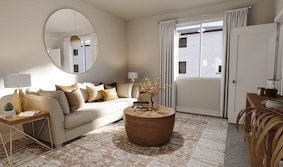
The 2020s interior design trends focus on sustainability and smart home technology, reflecting a global awareness of environmental impact and technological integration.
Eco-friendly materials and upcycled furnishings dominate, supporting a greener lifestyle. The rise of smart devices and home automation allows for energy-efficient and convenient living. Style-wise, there’s a shift towards minimalism with a twist, incorporating bold statement pieces and vibrant accents against a backdrop of neutral tones.
Multifunctional spaces are essential, accommodating remote work and wellness activities. Natural light and biophilic design principles enhance the connection to the outdoors, promoting health and well-being in home environments.
So, this doesn’t have numbers, and I like numbers, but I’ll buy that it’s at least a rough approximation of what things looked like. If this is correct, the shift away from vibrant colors had to have at least started by the 1980s. If you figure that new households had maybe people that were, say, 20, that’d be people maybe born in 1960, so late Boomers or maybe early Gen X are about the latest that the shift could have started.
That being said, it also seems fair to say that it was a progression, and it was probably taken further by later generations.
I always figured some of the cold and modern look you’d see in the 80s - at least from the upper upper class - was a reaction to some of what the 60s and 70s was known for and how garish and maybe gauche that seemed to people living in the 80s looking back on the (fashion) excesses of the 60s and 70s…I mean shag carpet and bright orange, holy shit.
I mean, the middle class and the poor cannot really cycle through things like this at the pace that the upper upper class can, and so I’d see things like avocado decor especially in the bathroom and kitchen which was tres cool in the 70s - for probably a year or two - in people’s homes well into the 80s and 90s and in some cases, the 00s. So I think what we experience in the everyday is probably blurred across decades of what is considered fashionable.
I think, from past reading, that some of the shift to white — well, or at least light colors — may have been with the intention of making interiors brighter. Like, more reflected light, so for a given amount of light from windows or from lamps, the room is better lit.
Like, I remember a lot of 1970s-era stuff looking dark and shadowed. Dark wood paneling and often darker furniture. If you look at photos of house interiors that people took, a lot were also kinda dark. The 1960 and 1970 shots from the above article aren’t dark, but those are gonna be professionally-taken pieces, might have light diffusers or whatever set up for the shot. If you have light colored stuff all over, the light bounces around more, get more diffuse lighting.
You can do even better if you do things like have mirrored walls, but that’s fragile and can be obnoxious.
So it might have been a shift based on functionality to try to get more and more-diffuse lighting, and white just happened to be the most-reflective color.
Today we can do energy-efficient diffuse lighting with things like LED strips. If wanting more diffuse light is the dominant factor causing a shift towards white, I wonder if extensive use of that might reduce the desire for light colors. Though…that doesn’t help where one is relying on sunlight during the day.
There are passive devices that can gather sunlight. I remember that sailing ships used to use these glass things that were flush with the deck but had a sort of crystal shape to pipe more light down to the top deck. That wasn’t a lot of light — ship interiors were dark — but maybe we could use some combination of that and other stuff.
searches
Apparently I’m thinking of a deck prism.
According to Wikipedia, something analogous was used in buildings, but electric lighting kind of killed it off.
https://en.wikipedia.org/wiki/Prism_lighting
Prism lighting is the use of prisms to improve the distribution of light in a space. It is usually used to distribute daylight, and is a form of anidolic lighting.
Prism lighting was popular from its introduction in the 1890s through to the 1930s, when cheap electric lights became commonplace and prism lighting became unfashionable. While mass production of prism lighting systems ended around 1940,[1] the 2010s have seen a revival using new materials.[2]
ETA: I just read that avocado made/is making some kind of comeback from the 1970s…yikes.