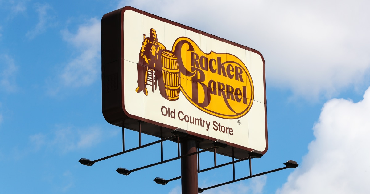
Could you tell me what the heck this yellow blob shape is supposed to be?
From a purely graphic design perspective, the classic logo is too busy and doesn’t scale well. The only thing it has going for it is the weirdness of the shape and the distinct color combination. It’s technically a really bad logo. You may not prefer the new logo but, technically, it’s a whole lot better. It’s far more adaptable to newer platforms while stilling being recognizable. Now, as far as being an effective representation of the brand and if that’s a corporate concern, I don’t know that I can comment on that.
In another post about this, someone posted a bunch of other fast food logos, and they all looked very much the same, especially in silhouette. They’re all just a same-y blend of mediocrity, whereas the existing logo was at least unique.
McDonald’s probably has the best and most distinctive logo out of anyone.


How was it awful?
Could you tell me what the heck this yellow blob shape is supposed to be?
From a purely graphic design perspective, the classic logo is too busy and doesn’t scale well. The only thing it has going for it is the weirdness of the shape and the distinct color combination. It’s technically a really bad logo. You may not prefer the new logo but, technically, it’s a whole lot better. It’s far more adaptable to newer platforms while stilling being recognizable. Now, as far as being an effective representation of the brand and if that’s a corporate concern, I don’t know that I can comment on that.
In another post about this, someone posted a bunch of other fast food logos, and they all looked very much the same, especially in silhouette. They’re all just a same-y blend of mediocrity, whereas the existing logo was at least unique.
McDonald’s probably has the best and most distinctive logo out of anyone.
Who cares
The yellow blob is a pinto bean. :)
I thought it was some splooge.
The barrel ain’t just full of crackers
Yellow blob is obviously a speech bubble.
Its not a speech bubble, its what the awful food will look like coming out on the other end of the tunnel
Lmfao
I don’t know if you’re serious or not.
I’m not. I know nothing about this brand or culture lmao
It’s somebody who sees the white guy and a barrel and said them two together.
100%, right here.