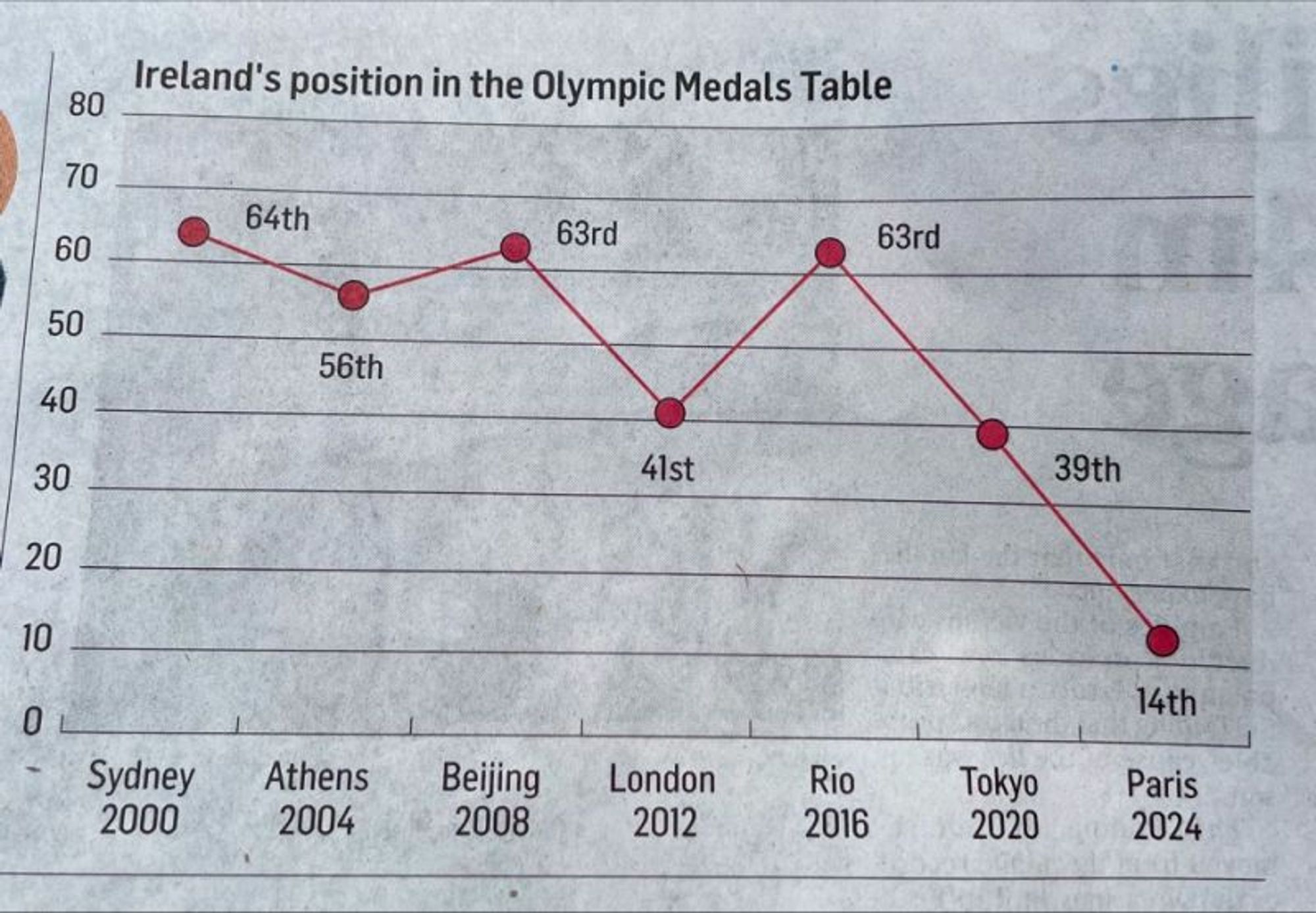
A bar chart for this kind of data makes no sense to me as the bar doesn’t really represent anything. A scatter plot is a good choice and adding a connection line for readability is imo not so bad. It should however be inverted going up to 1 and not down to 0.


A bar chart for this kind of data makes no sense to me as the bar doesn’t really represent anything. A scatter plot is a good choice and adding a connection line for readability is imo not so bad. It should however be inverted going up to 1 and not down to 0.