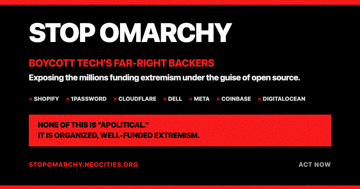
I get what u mean, but at the same time, there’s plenty of “friendly,” normal looking, and now probably AI generated, scam sites too. The colors are bold, but it’s a simple, informative design. And if we, the ones who read and try to be vigilant of bad actors, are the only ones it can reach, so be it ig.


I get what u mean, but at the same time, there’s plenty of “friendly,” normal looking, and now probably AI generated, scam sites too. The colors are bold, but it’s a simple, informative design. And if we, the ones who read and try to be vigilant of bad actors, are the only ones it can reach, so be it ig.
there’s way more non-friendly disinfo sites than those, the percentages
—have heard about this before
I suppose the question is then, how should this site have been designed iyo?
even the minimalist style shared by https://stallman-report.org/ and https://dmpwn.info/—heck, even the style of Time Cube (warning: better viewed on a phone)—would’ve been nicer than this.