I really don’t like the design of the progress pride flag, and I couldn’t really put my finger on it until I saw this: https://nava.org/good-flag-bad-flag
For reference, here is the flag I’m referencing as “bad flag”:

And here is the original:

So, the original has too many colors, but it’s the colors of the rainbow. In order. It’s recognizable from really far away, and it’s dead simple to draw.
With the Intersex flag, that’s 14 colors. There are three shades of “purple”. The circle won’t be visible from far away. The chevrons are too thin to be very recognizable from far away.
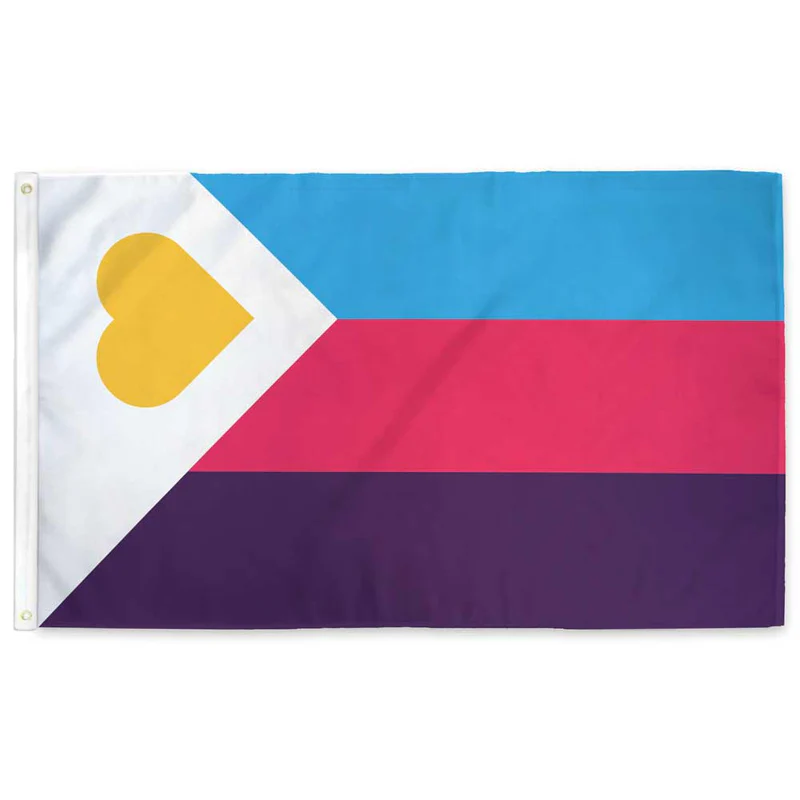
It’s not like there aren’t good pride flags. Like there are AMAZING ones:


Edit:
In case you don’t know what these are: https://flagsforgood.com/collections/pride-flags


This is the very reason I’m surprised. These flags come and go by the winds of memetics; so why is it that this design is somehow able to propagate so well despite being so clearly visually incoherent?
I’m not necessarily complaining, I’m just astonished that it caught on. Like imagine if a really discordant and structureless song became super popular.
I fly the original pride progress flag on my house and I really like it. If it is shocking to you that not everyone agrees with what makes a flag look good look no further than the US’s state flags. They’re a mess. They’re all over the place. People have different tastes. I think the “state seal on blue background” is bad but clearly enough people in those places don’t dislike it enough to change it.
pride flag indeed.