They definitely spent the equivalent of at least one or two laid-off employee’s salary to design a logo that’s worse than their last one.
miss u sm
Mozilla has had a rough year so far, with the PPA fiasco hurting its reputation in the open source community. To make matters worse, a recent wave of layoffs made people question if Mozilla had forgotten about their core principles.
I just like firefox.
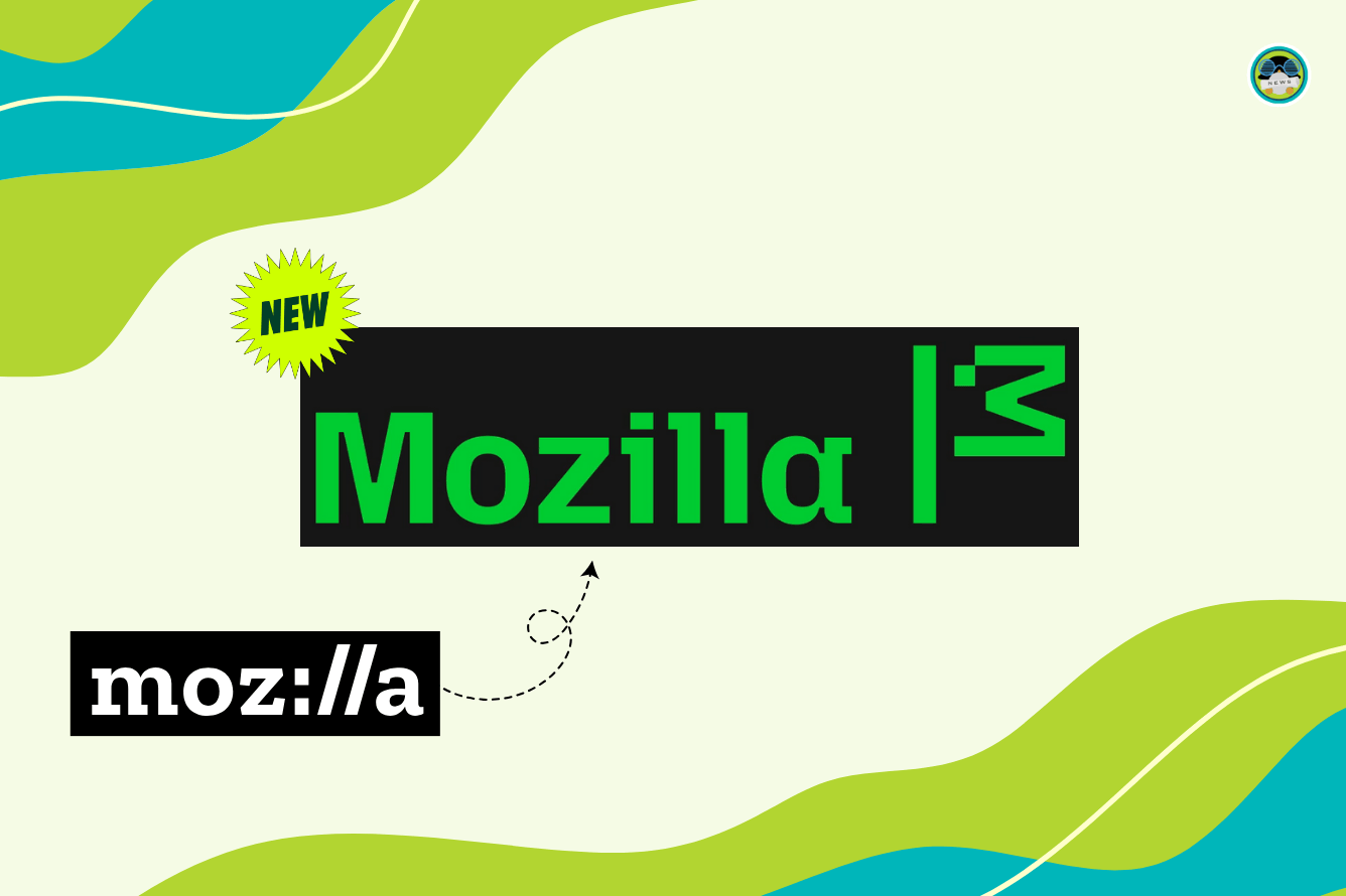
Meant to symbolize their activist spirit, the new brand identity of Mozilla involves a custom semi-slab typeface that spells Mozilla, followed by a flag that was taken from the M of their name.
What do I care.
I love gecko. I can’t not hate mozilla for some reason.
The 2017 one was based. All the other ones are a big fat meh, especially the 2024 one.
Yeah I’m really fond of the 2017 too, likely because I’ve started using Firefox again around that time.
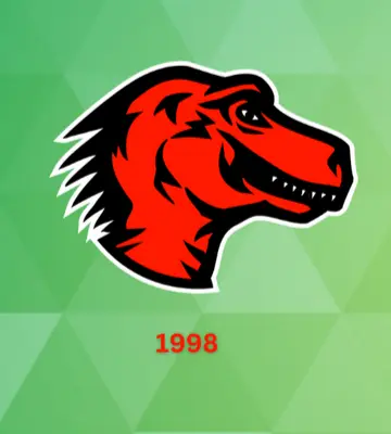
I don’t know why brands have to continuously update their branding, without any need (e.g. I understand why they no longer use the Red dino, that’s a bit outdated). On the other hand I don’t really care about branding, as it’s the product I actually care about.
Tbh it does not look much like a dinosaur / T-Rex to more like a chicken (flag?). BUt then again birds being the last dinosaurs etc …
first I was seeing it as a flag. now I see it as a dinosaur head with open mouth at the top of a flagpole
deleted by creator
Now the “ill” is back…
In the end it doesn’t matter.