
You must log in or register to comment.
Does this mean they’ll finally stop giving the fucking mobile site on desktop just because someone couldn’t edit out the “m.” from the link?
It’s a subtle thing, but I really appreciate that when sharing a link from Safari on iOS it puts the address on the clipboard without the “m.” automatically, so I don’t have to edit it out.
Hallelujah!
What took them so long?
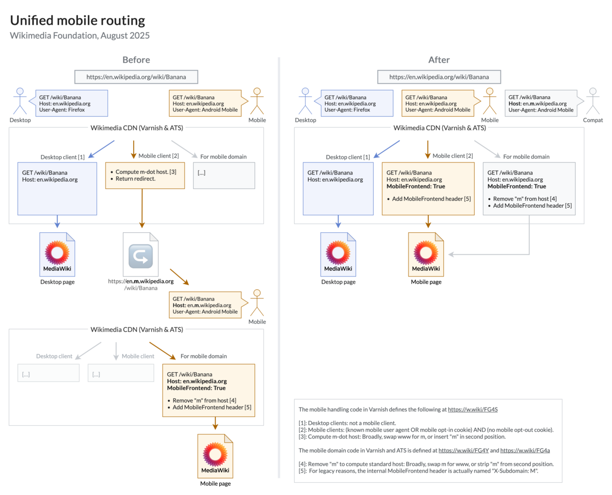
Sincere question: Why was there a separate mobile domain in the first place?
That was pretty standard for a while in web design - traditional “desktop” sites need a radically different layout when viewed from a smartphone, so from the dev side you’d check the size of the screen & redirect the user to the right subdomain for their device.
Nowadays it’s not really necessary.
I think they used separate style sheets. Going way back in time, to the early days of smartphones and back when non-smartphones had mobile web browsers, most websites would serve either a separate style sheet that gave a simplified layout for tiny screens or even an entirely different, simplified page. Early adopters to mobile browsing tended to hang on to that separation much longer than newer sites that took advantage of CSS that could adapt to the screen size.
Honestly I generally prefer the desktop sites and just zooming in than mobile sites that tend to badly fit everything on the screen.
Yeah, this is a remnant of Wikipedia supporting mobile devices really early.
I oppose their not changing the speed of light.